Business Requirements:
Uptick are a software company who were after branding and a new website after starting out without clear guidelines of their design direction.
Many elements needed to be considered from form design, list design and navigation design, along with colours, fonts, and layout for different purposes of the business i.e. brand collateral, websites, apps and social media collateral.
My Responsibilities:
My role involved designing each design element that would be used in their software as well as in marketing material. The design needed to be compatible with the development team’s existing framework, scalable on multiple devices and be an easy guide for the developers to understand and replicate.
My Approach:
I spent time with a lead developer, the marketing manager and product owner, to learn the depth of the product, the marketing approach, how users would be using this product, the target audience, and the process of the developers taking my design and implementing it.
Pivot Points:
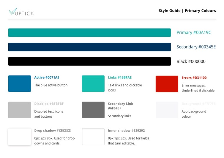
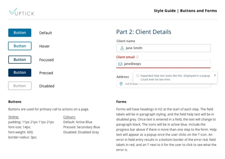
I uncovered the challenges the development team face in updating large amounts of their framework, so there were limitations in the amount of change I could do to the current design. The styles of drop downs, links, and forms could not be changed from the original framework, however the new branding was able to be applied everywhere else. This meant that while there was a compromise, the brand still had a sense of uniformity and presence throughout.
Impact:
The business now had a clear set of brand guidelines that could be easily applied across all material in the business and helped the business stand out while looking cohesive and consistent throughout their product and marketing material.