Business Requirements:
Oasis Ministries International (OMI) are a newly started Christian ministry, who were in need of branding and a new website. The client had a vision for their logo to represent a safe location amongst a calming environment, and concluded to use symbols from the Christian faith to symbolise this, including a palm tree and a calming sea.
My Responsibilities:
My role was to design their logo, branding guidelines and a set of usage notes for their branding that could easily be applied after the project was complete.
My Approach:
Step 1 of 4 – Logo:
Since there were to be a few elements to this logo, the initials of the business ‘OMI’ needed to be prominent so that a user could easily identify the business name amongst the design. A ‘short’ version of the logo was also required for the website’s favicon and homepage link.
![]()
![]()
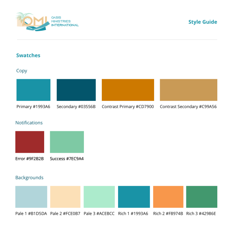
Step 2 of 4 – Colour Scheme:
Basing colour schemes and fonts from the logo, gold and blue were established as the primary colours. Gold was designed for elements that needed to immediately grab a user’s attention, and blue was designed for important points but that didn’t require as much focus.
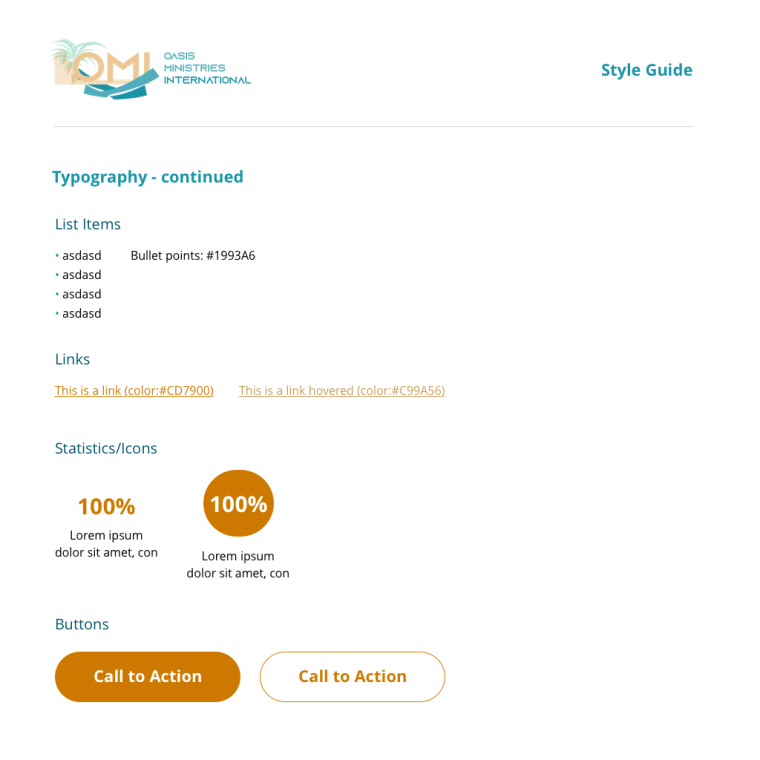
Step 3 of 4 – Fonts:
Choosing a basic web font was considered important to not encounter any rendering issues, while choosing a more fun font for the logo and print material allowed for personal style to their brand.
Impact:
The new brand guidelines allowed the business to have their own style and provide direction on how to approach designing other aspects of their business.