Business Requirements:
GraysOnline are a large online retailer of many different brands and products. The goal was to redesign an eDM that is sent out to customers daily, to help improve CTRs and refresh their dated design.
My Responsibilities:
I was tasked with redesigning the eDM from scratch, considering better placement for CTAs and product imagery that would entice users to click through and therefore improving CTRs.
My Approach:
Step 1 of 3 – Uncover current issues:
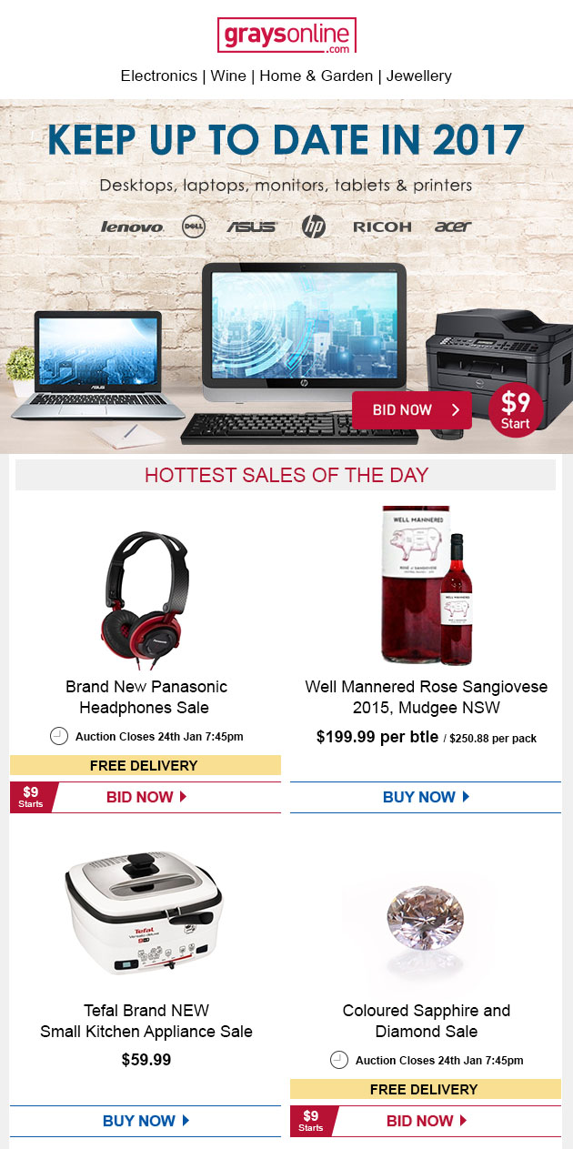
I first analysed their current eDMs below to uncover where the problem areas might be:
I uncovered the following:
- The original design has remained the same for many years and therefore did not keep up with changing user needs
- There was not much consistency with images or clearer indication of where the important information was i.e. differentiating the hierarchy of information rather than having all elements all having the same dominance
- The eDM as it stood was really lengthy and users were often not scrolling through to the end, resulting in products displayed towards the end not receiving much attention
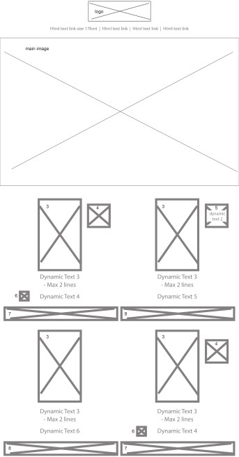
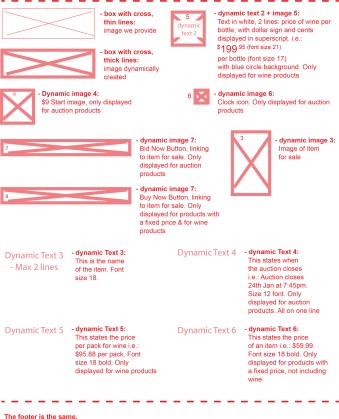
Step 2 of 3 – Developing Wireframes:
Wireframes were drawn to lay out where all the elements should sit, with a legend explaining all the elements to help developers understand how each element works and should be displayed.
The idea was to have different levels of hierarchy with the image having the most dominance, to help users instinctively see what was for sale, followed by the price and then the CTA.
The auction closing time held the least importance as most items were ending around the same time.
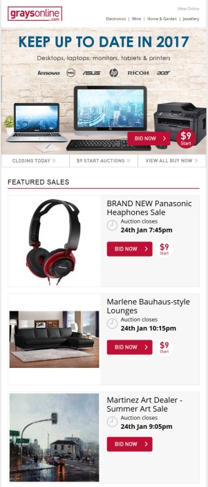
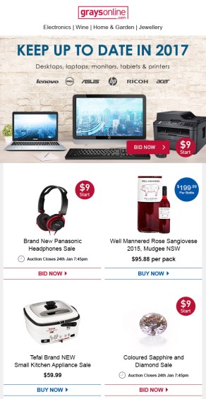
Step 3 of 3 – UI Design:
I then designed the UI to still keep inline with GraysOnline branding so that the user could still identify the eDM was from GraysOnline, but still different enough to notice the impact of the design changes. The new design also reduced clutter, clearly displaying information with appropriate levels of hierarchy for all elements.
Pivot Points:
After seeing slight improvements in CTRs but not as many as hoped, I analysed the new design further to see where it could be improved. I came to the conclusion that any information concerning the price (start prices, full prices and free delivery) should be near the CTA and not as a stamp in the top-right corner, to ensure important information was in closer proximity to each other, therefore ensuring quicker the information could be scanned through quickly with less viewing retention.
Impact:
The final design yielded a CTR of 33% which exceeded the business’ expectations of the new design and generated more leads for the business.
The final result can be viewed below: