
 by
by Business Requirements:
The team consisting of a Learning Designer, Developer and myself as the Designer, needed to create the user experience of an online learning course that was very content heavy. This course needed to show users how to use a new software introduced into the business (Australia Post).
This design also needed to be the base of a template that could be used across all courses for Australia Post. The design therefore needed to meet strict technical requirements so that it could be easily duplicated and manipulated for future courses, create an engaging experience for the user regardless of how content heavy the material was, and look easy to work through and visually captivating.
My Responsibilities:
To take the course material developed by the Learning Designer, and uncover the best way to present the information, how the user would work through the information and how the reward system would work, along with designing the UI. Throughout the process I worked closely with the Developer to ensure all design elements and feedback systems were achievable within the development constraints.
My Approach:
Step 1 of 4 – Identifying Potential Issues:
I began by first identifying the key potential issues that may reduce positive engagement with the course:
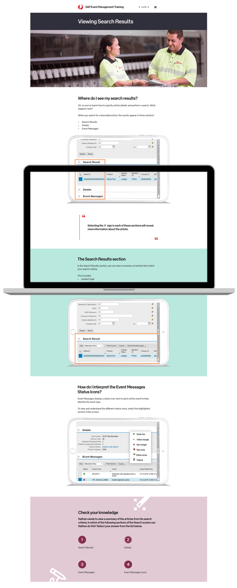
- Numerous screenshots of technical software needed to be displayed to show users how to use the new software. The software had dated UI and was not designed to look appealing. With numerous screenshots from it needed in this learning portal, it was crucial to find a way to both fulfil this requirement while having a fresh and modern UI.
- The need to read through a fair bit of content in order to retain required information for the quizzes throughout the course. I needed to find a way to present the content in a way that would peak the user’s interested and want to keep reading.
Step 2 of 4 – Designing the Feedback System:
The course needed to let users know when they had responded to a question incorrectly or correctly, at ideal intervals in order to provide input for the user to continue with their next decision in their course, but not appear too frequently so that it became a distraction.
We also needed to ensure language around an incorrect answer was still positive to encourage the user to try again. Working with the Learning Designer on this decision, we decided to have the feedback display after a series of a few questions rather than each one, combined with engaging visuals as indicators of the user’s progress in case they didn’t read the corresponding feedback with it.
Step 3 of 4 – Designing the UI of Quiz Sections, Feedback Screens, Screenshots and Callouts:
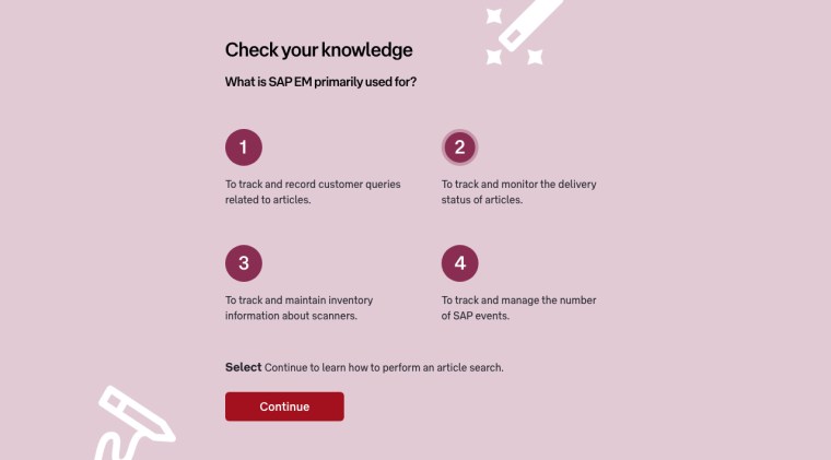
Quiz Sections:
I decided to add icons to all questions that subtly represented learning and the excitement of it. I decided to use a wand to indicate where the section was and to show the fun in applying knowledge learned. I also decided to use a pencil to indicate writing down an answer like in a printed exam. I used a pale background in order for the questions to have the most focus, and big icons to click on for the user’s answer:
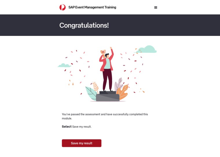
Feedback Screens:
It was important the user felt the right responses to their efforts in the quiz (e.g. positive and happy that they completed the course successfully, and wanting to improve if they didn’t or answered a question incorrectly).
I decided to work with the colours in Australia Post’s style guide and use the really soft and bright colours that they had to evoke a happy response if the user completed the course successfully. I also decided to use illustrations of people without faces and have the environment showcase the emotion, to have a design that is not so literal yet still evokes a positive response:
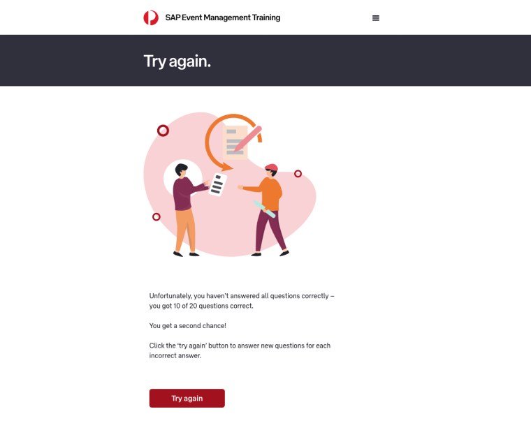
For the feedback indicating an incorrect answer, I decided to stick with a more analogous palette of reds and oranges, for the user to associate with a negative response. I also used a touch of warm purple and ensured the imagery was light and soft in order to evoke a gentle response rather than a harsh, disengaging one:
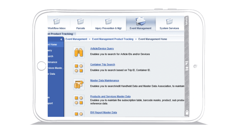
Screenshots:
I needed to present the screenshots of the software in a way that looked light and easy to digest, to take a way from the clunky look and feel of the software. I decided to place the screenshots in the frame of an iPad that was hand drawn and in white. This helped to lighten and soften the look of the contents in the iPad:
Callouts:
Callouts needed to be presented in a way that stood out from the lengthy content despite being more content to read through. We used callouts as a tool to allow users to capture key takeaways from the material quickly. I decided to design a clean and simple look for the callout, using Australia Post’s signature red for a line indicating where the user needed to look, and quotation marks to indicate a callout:

Step 4 of 4 – Designing the UX and UI:
The next step was to combine all the UI elements along with all the content in a clear, concise and appealing manner.
I decided to use a lot of negative space and soft colours for backgrounds to allow for breathing room around content, a clear colouring system to help users identify sections (e.g. one colour for screenshots, one for quizzes, etc) and good spacing and leading between copy and sections.
Pivot Points:
Working closely with the Developer and Learning Designer we uncovered only a few minor setbacks that needed to be addressed:
- The icons for quizzes needed to be built and designed as standard radio buttons instead, in order for the course to be easily duplicated and manipulated for future courses
- The outlines on screenshots highlighting key areas needed to be a bolder more contrasting colour like orange, in order to stand out more on the screen; originally they were designed in gray
Impact:
The final result was a clean, simple, functional, easy to replicate and manipulate course that the client was extremely happy with, as it was now a tool that could be used throughout their business for users of any skill level to easily learn the new software the business had in an engaging and fun way.
 RMarshall Designs