
Business Requirements:
GraysOnline are a large online retailer of many different brands and products. GraysOnline were working with Middle Eastern Plant & Equipment, who were needing a redesign of their website. The design and structure needed to be based on the GraysOnline website in order for the development team to develop it effectively.
My Responsibilities:
I was in charge of designing the checkout page of the website, using Middle Eastern Plant & Equipment (MEPE)’s branding while using the structure of the already existing GraysOnline website.
My Approach:
Step 1 of 3 – Sketching out solutions:
I started by sketching out areas of improvement on the current GraysOnline checkout page in regard to user experience.
Sketches to identify elements on the page, and to work out if any elements could be removed or rearranged:
Sketch 1:

In Sketch 1, similar to the GraysOnline page, all the elements are attached to each other, but then once the user adds another item, it would involve the item description for all their items pushing everything else to the bottom with the user having to scroll to access information such as ‘redeem voucher’, ‘total price’ and ‘checkout’, which are all important steps that should be seen instantly, without having to scroll back and forth.
Sketch 2:

In Sketch 2, the above issues were considered, and the shipping, total price and checkout options were fixed to the top right, with the items separate on the left. This way the user would always have focus on the checkout process with less distractions.
Step 2 of 2 – UI Design and improving UX:
The images below show the before and after; the left being the current GraysOnline checkout process, and the right being the redesigned checkout process for Middle Eastern Plant & Equipment.
Checkout Page 1:
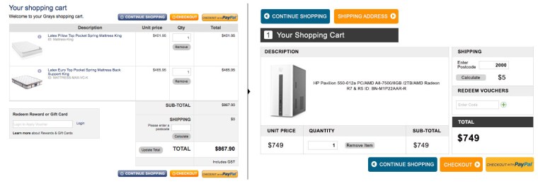
The aim in each step of the checkout process was to remove any distractions and keep the user focused on the end-goal of purchasing, and to have important information easy to find for the user, in this case, the total price, shipping details and where to enter any voucher numbers. Separating this information to stay fixed on the right with checkout options directly underneath keeps the user focused as people naturally look to the right and with nothing else around it or moving with it, there are less distractions on the page that would lead the user away from purchasing.
Checkout Page 2:
As seen on the left, there is a lot of redundant and unnecessary information that makes the form look more complicated than it actually is. The more simple and straightforward a form looks, the more likely the user will be inclined to fill it out.
The following was removed:
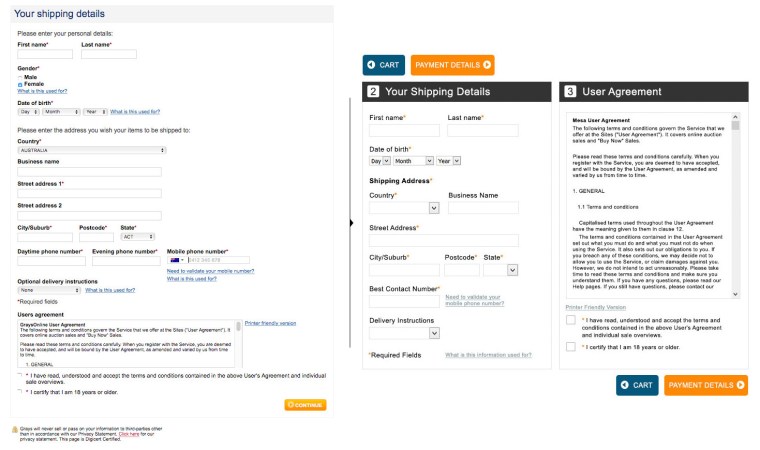
• The statements ‘please enter your personal details’ and ‘please enter your address’ was the first step as it is self explanatory that the user needs to do this. Any additional text that does not need to be there is another distraction that may lead the user away from continuing with the checkout process.
• The question asking for gender was removed to keep with the times as many users may see this as an unnecessary question to ask and may think the business is dated for thinking this question is necessary.
• ‘Business name’ and ‘street address line 2’ was also removed, as the user should be able to write their address in one box and the business name should not affect the purchase of items. The user has separate boxes for entering the suburb, postcode and state for mailing purposes, so having the extra street line seemed superfluous.
• Removing all the text boxes asking for three different phone numbers makes this small process of adding in a phone number quite cumbersome as each question you ask a user is another step for them before purchasing. Removing this and just adding ‘best contact number’ was the most efficient way for both the user and the business.
• Removing the word ‘optional’ from ‘optional delivery instructions’ was necessary as mandatory questions are indicated with an asterisks, so there is no need to state that a question in the form is optional as the user would know this by not seeing an asterisks next to it.
• Separating the user agreement from the form allows the user to clearly see where the form starts and ends, and makes the form look less cluttered as there is less text around it. The user agreement form was moved to the right with bigger check boxes where the user ticks to agree, sitting just above the button for the next step of the checkout. The bright colour of the button, the big check box and the simpler form makes this whole step much less cumbersome and more straight forward for the user.
Checkout Page 3:
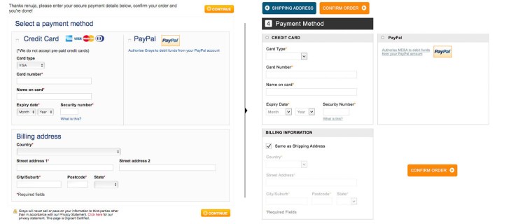
Allowing the user to tick ‘same as shipping address’ instead of checking or filling out the billing address form again is one less step for the user, and separating all three sections (credit card, PayPal and billing address) makes it easier for the user to see where everything is and starts and finishes. To continue to keep this minimal, removing the text at the top explaining to the user what to do was the next step as it is self explanatory by the text ‘payment method’.
Checkout Page 4:
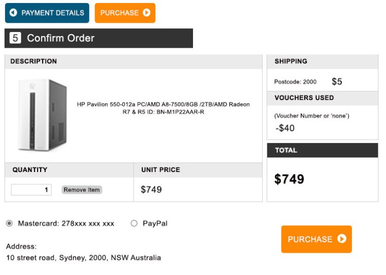
This page was created to ensure the user could easily see everything they needed to confirm before purchasing their product e.g. total price, payment option and shipping address. The user still has the option to remove the item as seen next to ‘quantity’.
While the aim is to keep the user focused on purchasing, if they decide they no longer want the item and the ‘remove item’ option is too difficult to find, this will add frustration to the experience which will make the user less likely to shop with this checkout process again. Therefore having the ‘remove item’ button visible but still faint so as to not draw too much attention to it lets the user know while they are in the middle of purchasing they are still in control, as users are more likely trust an experience if they feel they have some level of control in it.
Pivot Points:
Due to constraints in the development team, a few compromises to the design needed to be made, including the two column design. The design was kept to the original one column, but now included clearer headings and larger buttons, along with the same layout as the new design, still significantly improving the overall experience.
Impact:
With a much simpler and straight forward checkout process, users are able to stay focused and are less likely to abandon cart at checkout.
